Plotting
R is capable of giving very nice graphical plots. We will go over the most popular package ggplot2 for drawing static graphics and dygraphs for dynamic graphs
Learning objectives:
Use ggplot2 to draw basic plots (scatter plot, boxplot, line chart, histogram, frequency polygon, and barchart)
Use ggtheme to improve appearance
Use dygraphs to draw interactive graphs
ggplot2 package
ggplot2 is a powerful package to draw graphics. It implements the grammar of graphics (and hence its name).
install.packages("ggplot2")
library(ggplot2)
Two plotting functions in the package:
- qplot() and
- ggplot().
While qplot() is useful to plot quickly, most of time, one should use ggplot() for systemic plotting
qplot(x, y, dataframe, geom="type")
ggplot(data, aes(x,y))+ geom_type() + options
x<-1:30
y<-c(5,4,5,3,4,6,7,4,2,1,5,6,2,2,2,
5,6,7,8,6,2,8,7,8,8,3,3,7,2,1)
z<-c('A','B','A','A','B','A','B','B','A','A',
'B','A','A','A','B','A','A','B','A','B',
'B','A','A','A','B','A','A','B','A','B')
df<-data.frame(x,y,z)Qplot
Scatter plot is useful to depict relationship between two variables.
qplot(x, y, data=df, geom="point")
Box plot: use when one variable is continuous, another is categorical (discrete). Then box plot is an alternative to scatter plot.
qplot(z,x, data=df, geom="boxplot")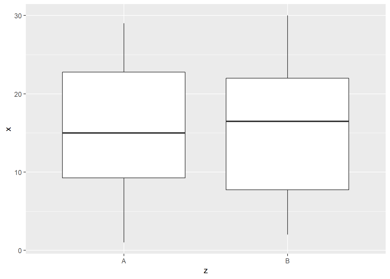
Line plot is useful to show time trend and how two variables are related. Compared to scatter plot, line plot is most useful if the horizontal variable does not have any duplicated values.
qplot(x, y, data=df, geom="line")
Histogram is useful if we want to visualize the distribution of single continuous variable.
qplot(y, data=df, geom="histogram",binwidth = 3)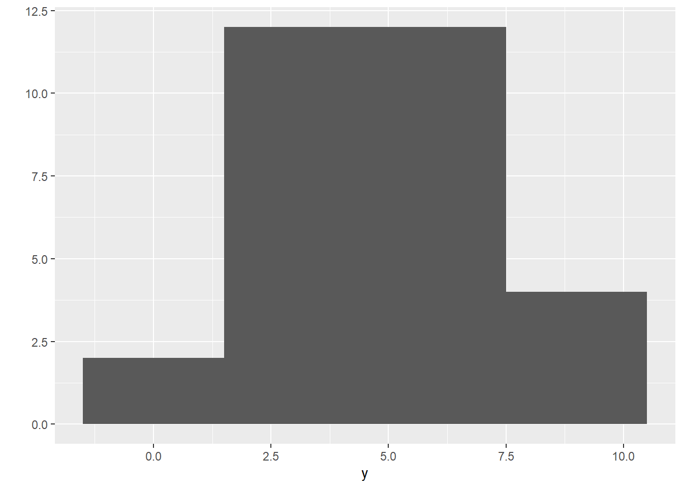
Density plot is similar to histogram but there is no grouping as in histogram but the function is smoothed.
qplot(y, data=df, geom="density")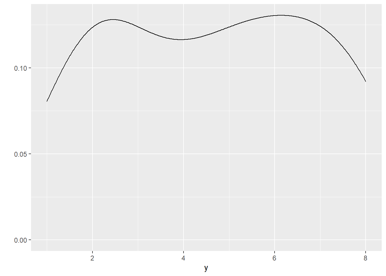
Bar chart is similar to histogram but it is for discrete data.
qplot(z, data=df, geom="bar")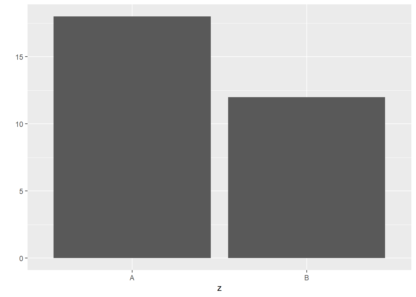
ggplot
The syntax for base plots is as follows:
ggplot(data)+aes(x,y)+geom_point()
ggplot(data)+aes(x,y)+geom_boxplot()
ggplot(data)+aes(x,y)+geom_line()
ggplot(data)+aes(x)+geom_histogram()
ggplot(data)+aes(x)+geom_freqpoly()
ggplot(data)+aes(x)+geom_bar()
Scatter plot
ggplot(df)+aes(x,y)+geom_point()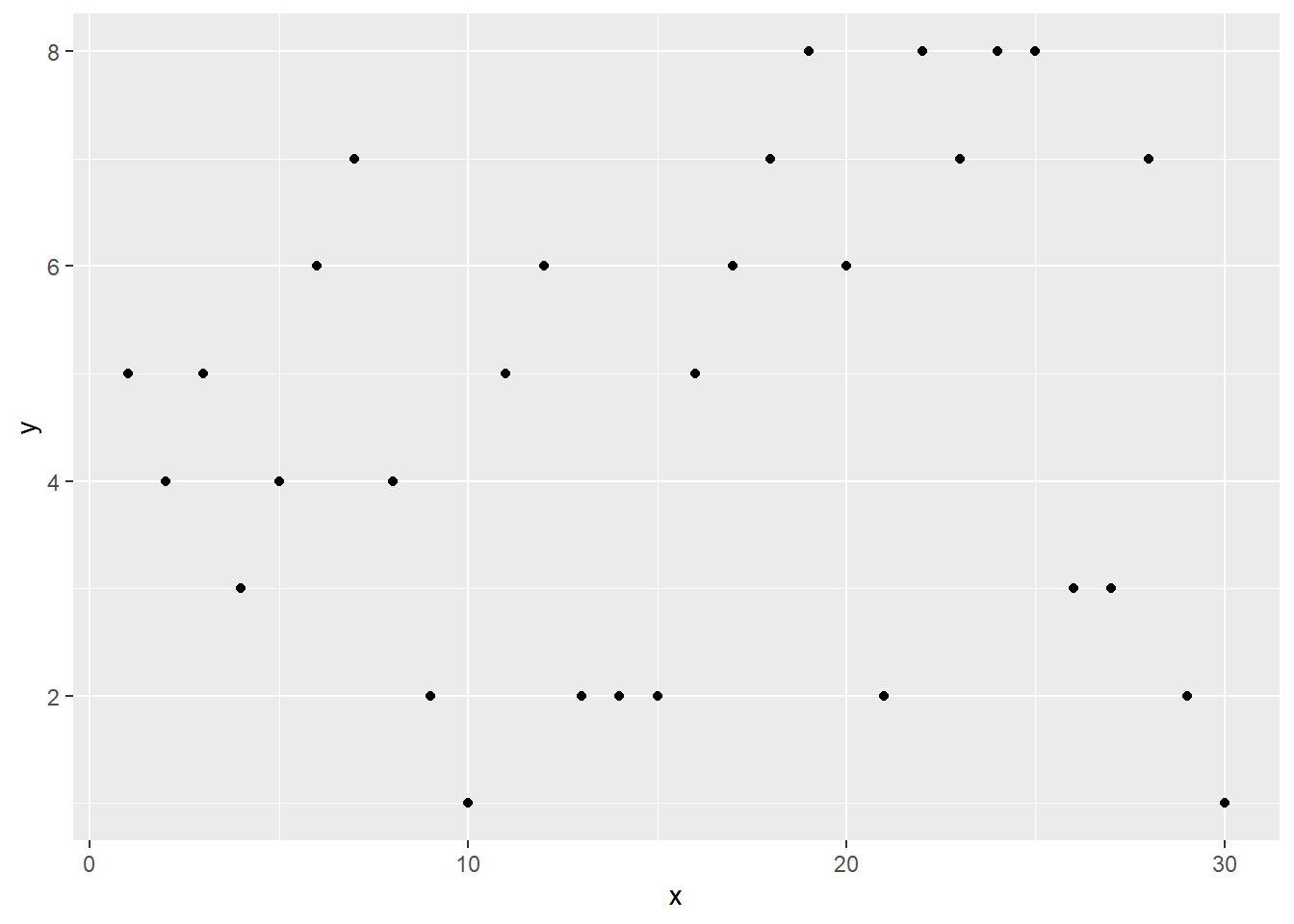
Boxplot
ggplot(df)+aes(z,x)+geom_boxplot()
Lineplot
ggplot(df)+aes(x,y)+geom_line()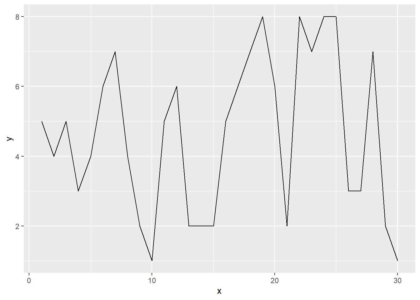
Histogram
ggplot(df)+aes(y)+geom_histogram(binwidth=1)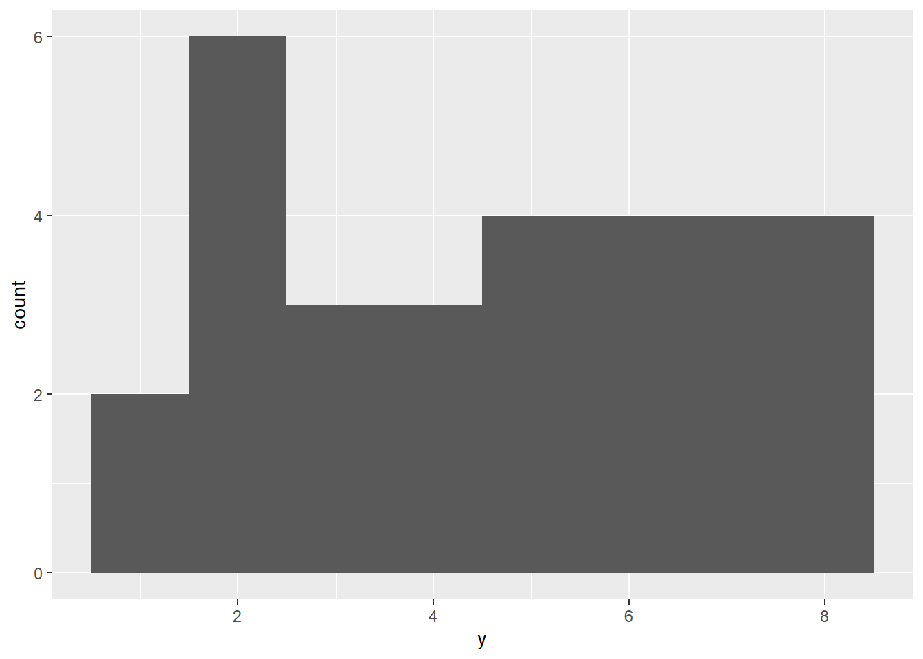
Frequency polygon
ggplot(df)+aes(y)+geom_freqpoly(binwidth=1)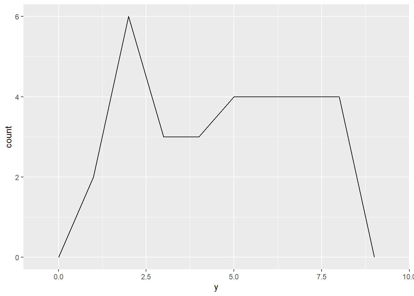
Bar Chart
ggplot(df)+aes(y)+geom_bar()
Aesthetic
To improve the appearance, we can change color, shape (for scatter plot) and size (for scatter plot).
Color: aes(x,y, color=z)
ggplot(df) +aes(x,y, color=z) + geom_point() 
shape: aes(x,y, shape=z)
ggplot(df) + aes(x,y, shape=z) + geom_point() 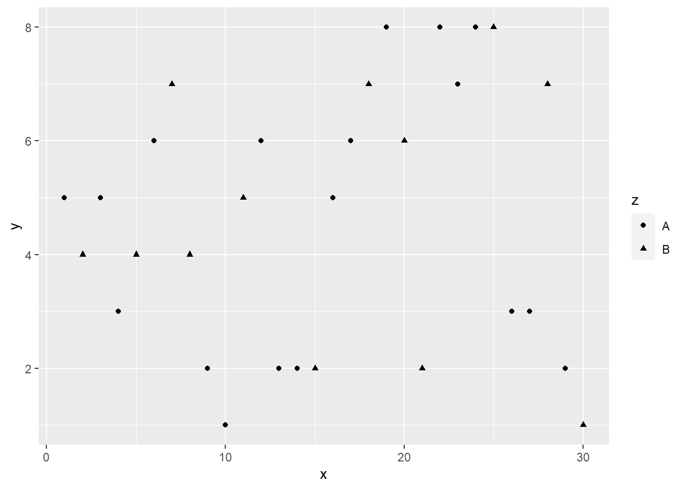
Size: aes(x,y, size = 3)
ggplot(df) + aes(x,y, size = 3) + geom_point() 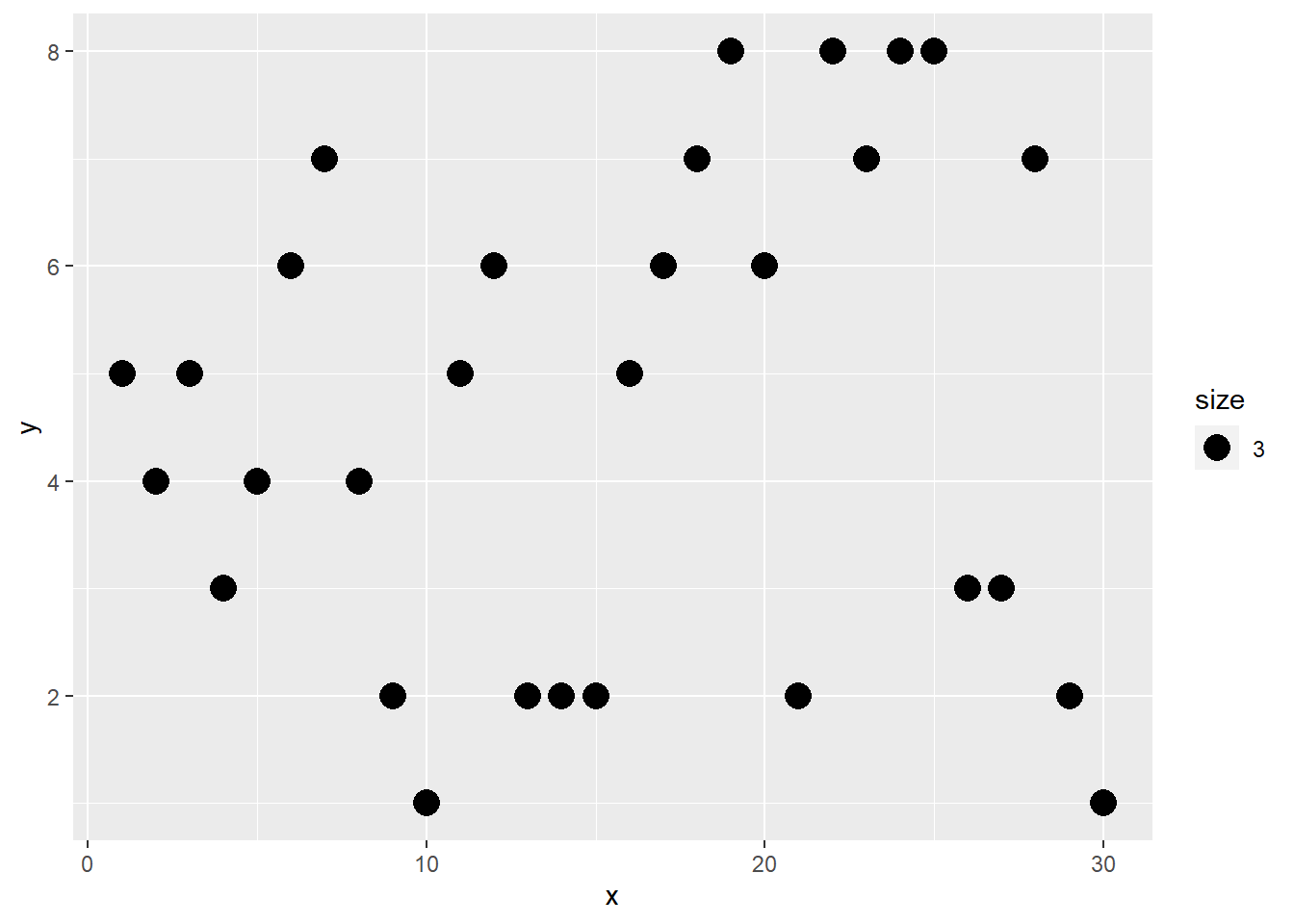
Decoration
To improve the readability of plot, one may add title, label axes, and provide legend.
Add title by using ggtitle()
ggplot(df) + aes(x,y)+ geom_point()+
  ggtitle("title")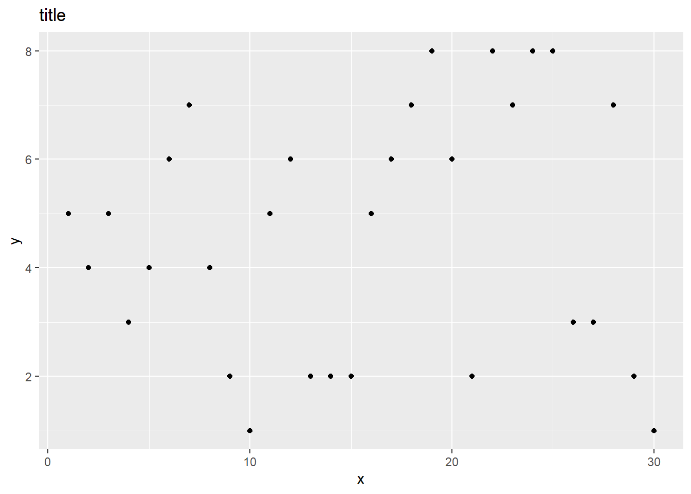
Label Axes using xlab() and ylab().
ggplot(df) + aes(x,y)+ geom_point()+
  xlab("X axis") + ylab("Y axis")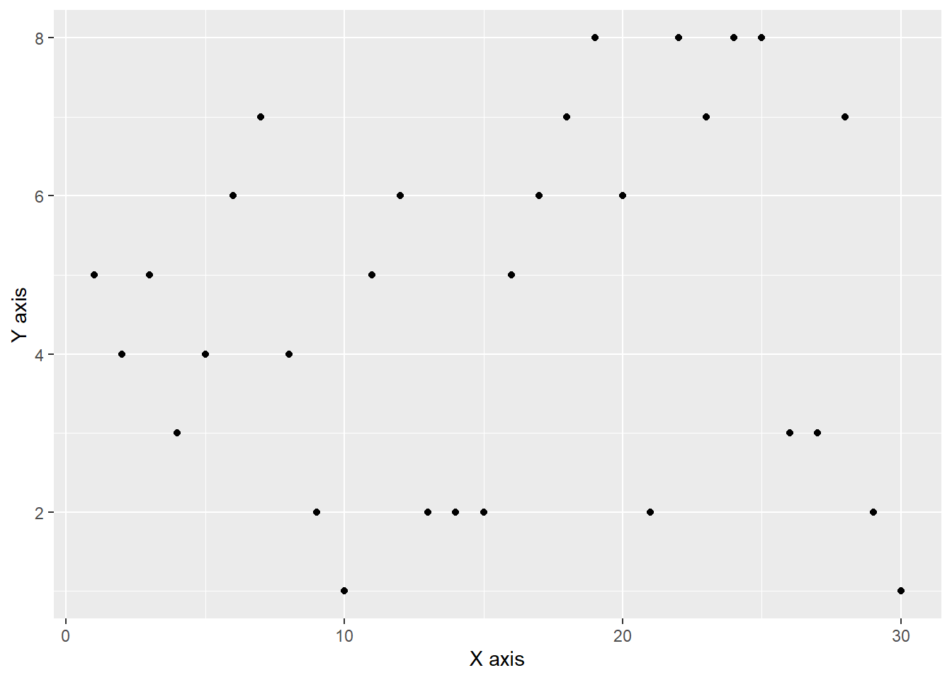
Legend can be added using theme(legend). The position can be top, right, left and bottom.
ggplot(df) + aes(x,y,color=z)+geom_point()+
  theme(legend.position = "bottom")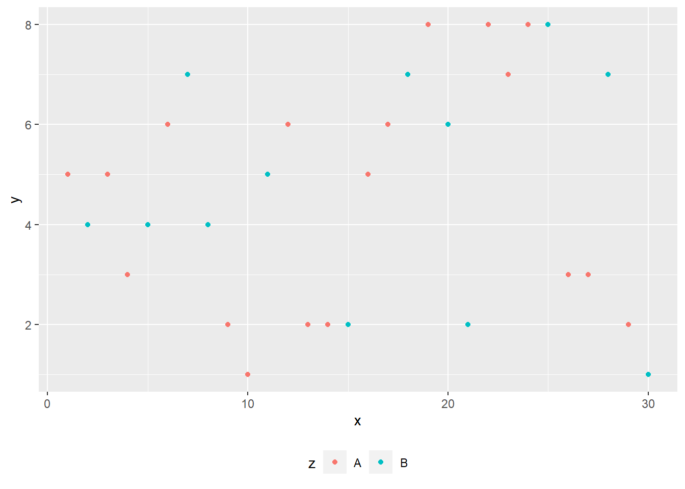
Basic themes
We can also change the theme of the plot. There are four basic themes.
+theme_grey()
+theme_bw()
+theme_minimal()
+theme_classic()
Basic themes: Grey
ggplot(df)+aes(x,y, color=z)+geom_point()+
  theme_grey()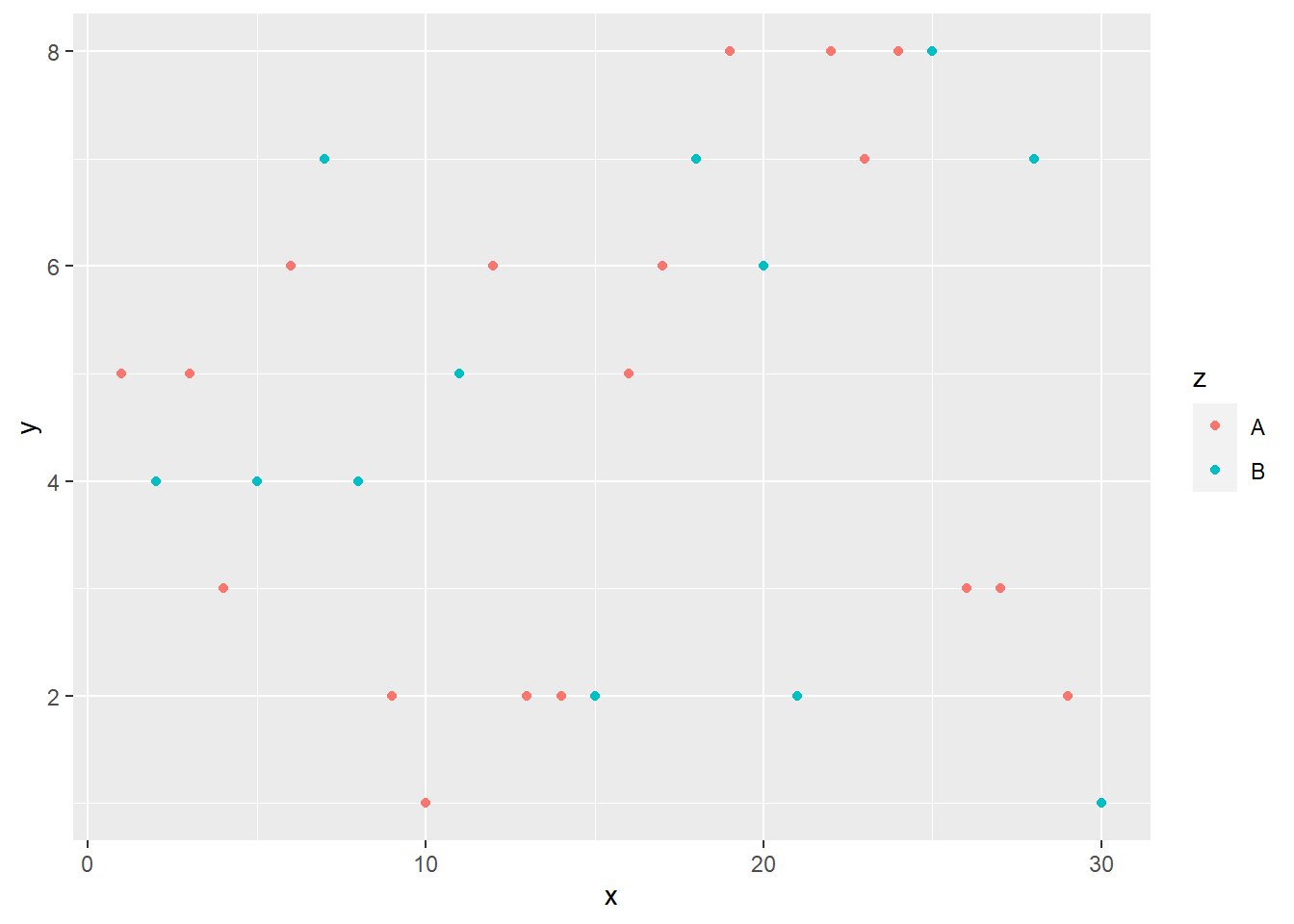
Basic themes: BW
ggplot(df)+aes(x,y, color=z)+geom_point()+
  theme_bw()
Basic themes: minimal
ggplot(df)+aes(x,y, color=z)+geom_point()+
 theme_minimal()
Basic themes: classic
ggplot(df)+aes(x,y, color=z)+geom_point()+
  theme_classic()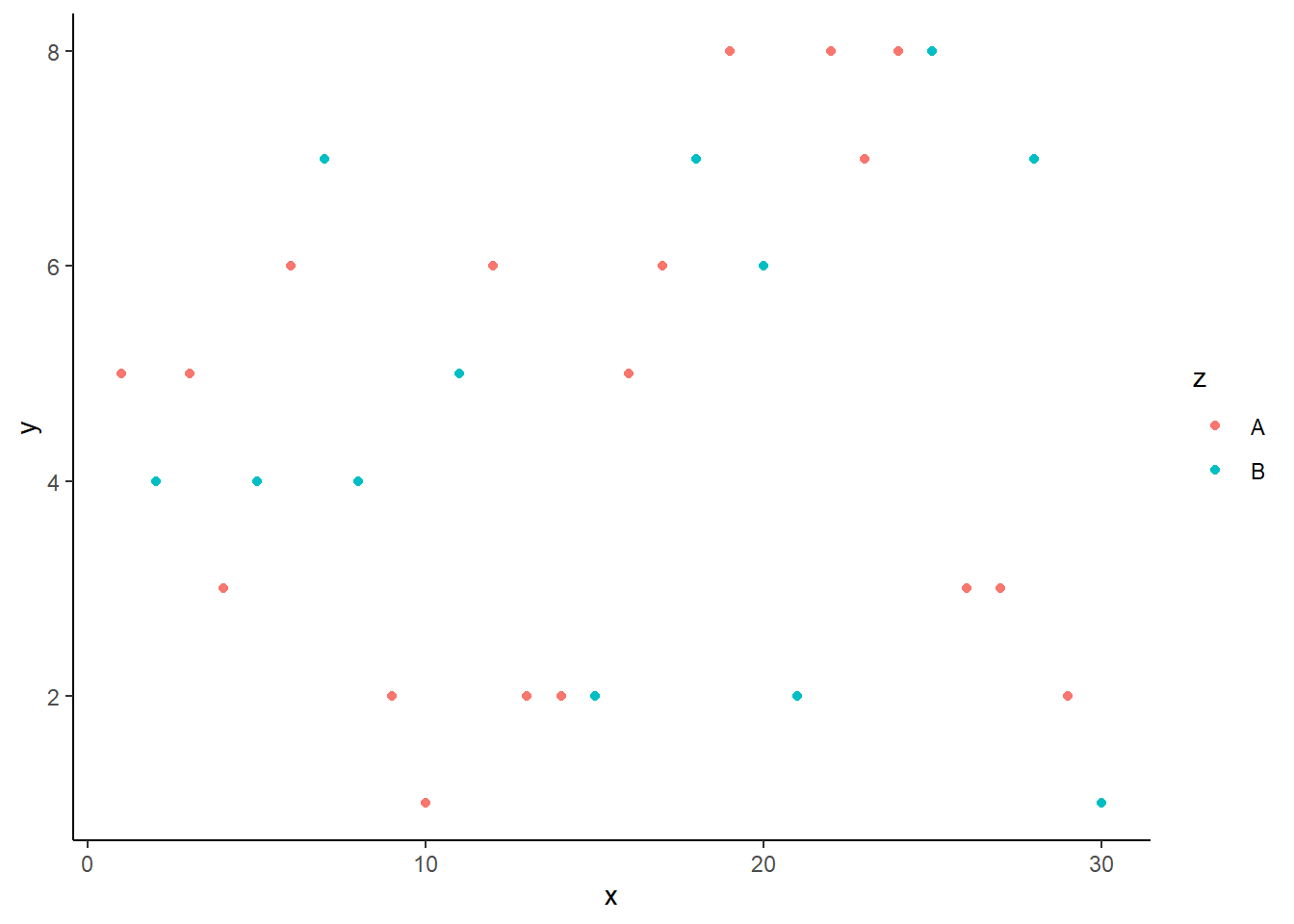
ggthemes package
Finally, we want to introduce a better theme for plotting. Here, we need to install and load the ggthemes package.
install.packages("ggthemes")
library(ggthemes)
There are three interesting themes:
- Stata,
- Excel, and
- Economist.
To get the Stata theme, we use theme_stata() and scale_colour_stata()
ggplot(df) + aes(x,y, color=z)+ geom_point()+
  theme_stata() + scale_colour_stata()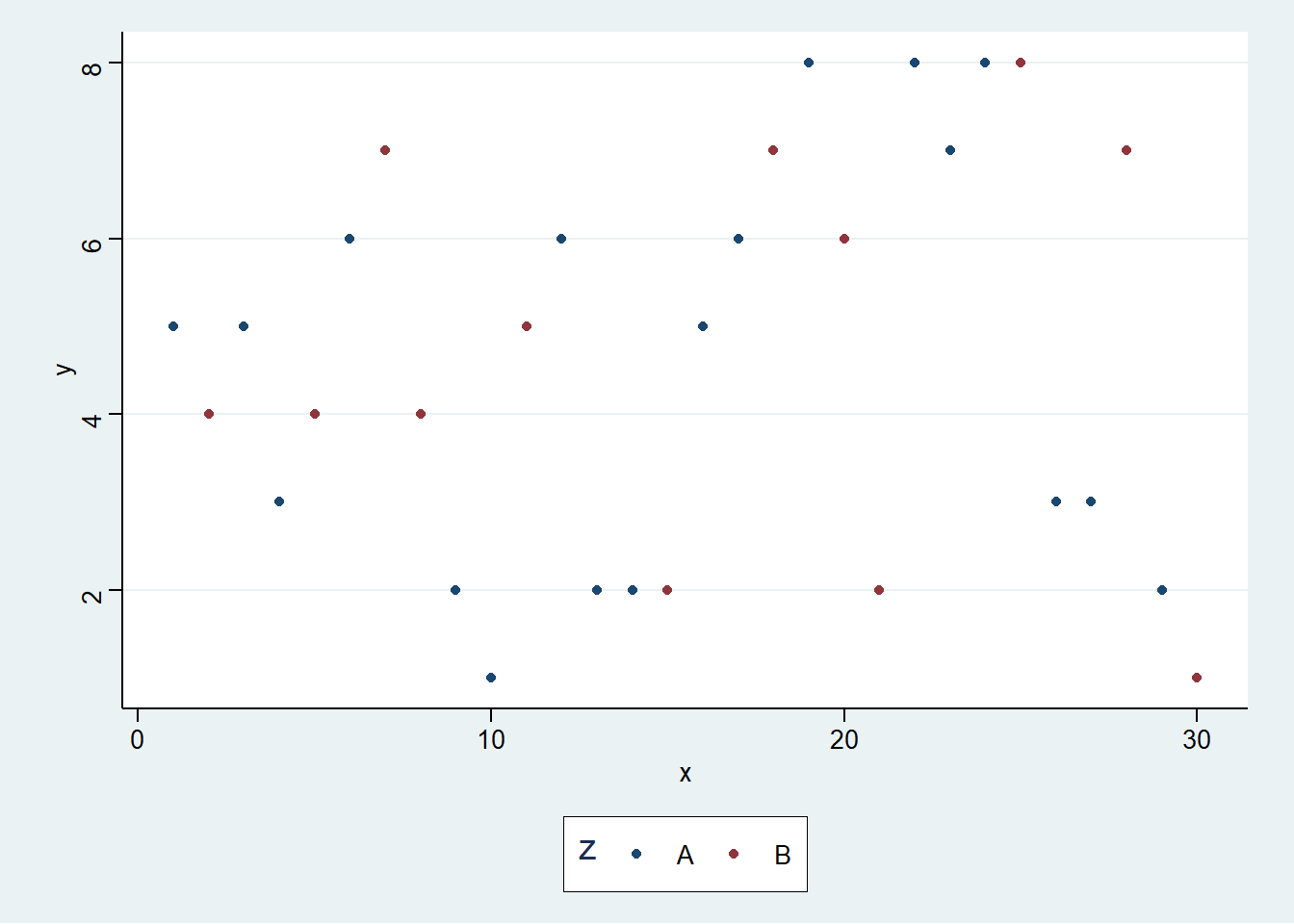
To use the Excel theme, we use theme_excel() + scale_colour_excel(). It is not recommended to use it in practice.
ggplot(df) + aes(x,y, color=z)+ geom_point()+
  theme_excel() + scale_colour_excel()
To create the theme like the Economist magazine, we can use theme_economist() and scale_colour_economist().
ggplot(df) + aes(x,y, color=z)+ geom_point() +
theme_economist() + scale_colour_economist() 
Here is the Economist theme with some further decorations.
ggplot(df) +
  geom_line(aes(x,y, colour = z), size=1.5)+
  theme_economist() + scale_colour_economist()+
  theme(legend.position="bottom",
        axis.title = element_text(size = 12),
        legend.text = element_text(size = 9),
        legend.title=element_text(face = "bold",
                                  size = 9)) +
  ggtitle("Title")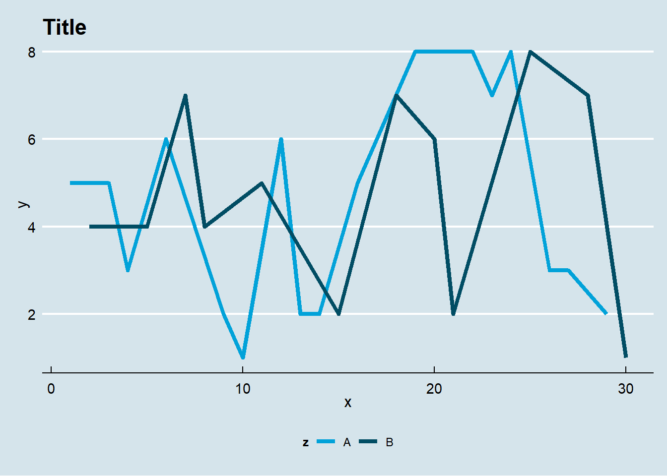
Application: Worldbank
We want to illustrate our plotting function using data from the World Bank. We will use the wbstats package to download data, and reshape package to convert the data into long format.
library(wbstats)
library(dplyr)
library(reshape)
df<- wb(country=c("US", "SG"),
indicator = c("SP.POP.TOTL",
"NY.GDP.PCAP.KD"),
startdate = 2000, enddate = 2017)
df <- dplyr::select(df, date, indicator,
country,value)
temp <- melt(df,
id=c("date","indicator","country"))
charts.data <- cast(temp, country + date~indicator)
colnames(charts.data) <- c("country", "year","gdp", "pop")
charts.data$year <- as.numeric(charts.data$year)Now we are ready to plot the graph.
p1<-ggplot()+
  geom_line(aes(x = year,y = gdp,color = country),
            size=1.5, data = charts.data)+
  theme_economist() + scale_colour_economist() +
  theme(legend.position="bottom",
        axis.title = element_text(size = 12),
        legend.text = element_text(size = 9),
        legend.title=element_text(face = "bold", size = 9)) +
  ggtitle("GDP per capita (US$)")
print(p1)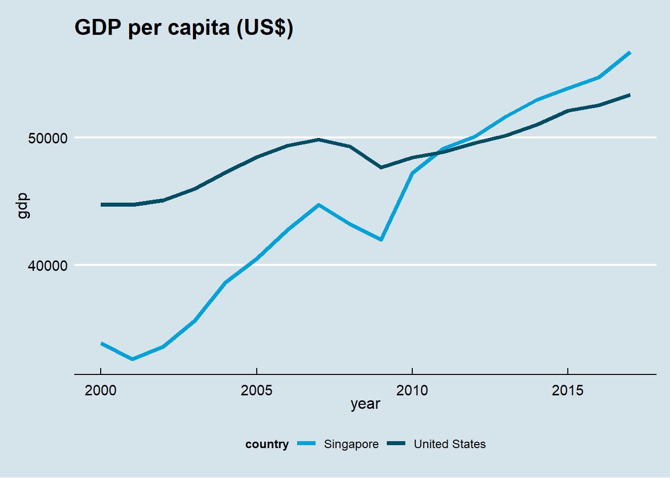
dygraphs package
The package dygraphs produces dynamic graphics so that user can interact with the graph.
To illustrate our idea, we use stock data download using Quantmod package.
Get Data Using Quantmod
The following code install and download the quantmod package. Then it downloads the daily stock price data of Apple (ticker: AAPL).
We use getSymbols() to download data:
install.packages("quantmod")
library(quantmod)
# getSymbols(): to get data
getSymbols("AAPL")
Take a look at the data:
# OHLCVA data
head(AAPL,n=3)
## AAPL.Open AAPL.High AAPL.Low AAPL.Close AAPL.Volume AAPL.Adjusted
## 2003-01-02 0.5083427 0.5281666 0.5079888 0.5239188 45357200 0.915166
## 2003-01-03 0.5239188 0.5285210 0.5164849 0.5274589 36863400 0.921349
## 2003-01-06 0.5320605 0.5444505 0.5267507 0.5274589 97633200 0.921349# Get OHLC data
price<-OHLC(AAPL)
head(price, n=3)## AAPL.Open AAPL.High AAPL.Low AAPL.Close
## 2003-01-02 0.5083427 0.5281666 0.5079888 0.5239188
## 2003-01-03 0.5239188 0.5285210 0.5164849 0.5274589
## 2003-01-06 0.5320605 0.5444505 0.5267507 0.5274589The following code install and download the dygraphs package.
install.packages("dygraphs")
library(dygraphs)
getSymbols("AAPL")
getSymbols("SPY")
We will plot four different dynamic plots:
- standard dynamic,
- shading,
- event line, and
- candle chart.
Standard dynamic graph
The function dygraph() display time series data interactively. Move your mouse on the diagram.
dygraph(OHLC(AAPL))Shading
graph<-dygraph(Cl(SPY), main = "SPY")
dyShading(graph, from="2007-08-09",
          to="2011-05-11", color="#FFE6E6")
Event line
graph<-dygraph(OHLC(AAPL), main = "AAPL")
graph<-dyEvent(graph,"2007-6-29",
               "iphone", labelLoc = "bottom")
graph<-dyEvent(graph,"2010-5-6",
               "Flash Crash", labelLoc = "bottom")
graph<-dyEvent(graph,"2014-6-6",
               "Split", labelLoc = "bottom")
dyEvent(graph,"2011-10-5",
        "Jobs", labelLoc = "bottom")
Candle Chart
AAPL <- tail(AAPL, n=30)
graph<-dygraph(OHLC(AAPL))
dyCandlestick(graph)